轮播图经常会在项目里用到,但是实际上用到的轮播图都是比较简单的,没有复杂的特效,这个时候如果去引入swiper那些库的话,未免就有点杀鸡焉用牛刀了。
所以不如自己手写一个,而今天我要分享的一种写法也是我最近才发现的,发现写起来真的是很丝滑,只纯css就实现了呢!
可以先看看预览效果
预览地址:https://sunny-lucking.github.io/howToBuiMySwiper/myswiper.html
源码地址:https://github.com/Sunny-lucking/howToBuiMySwiper/blob/main/myswiper.html
<label> 标签的 for 属性的用法及作用for 属性规定 label 与哪个表单元素绑定,label的for属性要与绑定表单元素(input)的ID对应。绑定完成后可以通过点击label触发表单元素的默认属性。通俗的讲就是你绑定完了点lebel就相当于点击表单元素(input)。
<form> <label for="male">Male</label> <input type="radio" name="sex" id="male" /> <br /> <label for="female">Female</label> <input type="radio" name="sex" id="female" /></form><!DOCTYPE html><html><head> <meta charset="utf-8"> <title>我的轮播图</title> <style> body { display: flex; justify-content: center; align-items: center; min-height: 100vh; } ul.slides { position: relative; width: 600px; height: 280px; list-style: none; margin: 0; padding: 0; background-color: #eee; } li.slide { margin: 0; padding: 0; width: inherit; height: inherit; position: absolute; top: 0; left: 0; display: flex; justify-content: center; align-items: center; font-family: Helvetica; font-size: 120px; color: #fff; transition: .5s transform ease-in-out; } .slide:nth-of-type(1) { background-color: #F2E205; } .slide:nth-of-type(2) { background-color: #F25C05; left: 100%; } .slide:nth-of-type(3) { background-color: #495F8C; left: 200%; } </style></head><body> <ul > <li >1</li> <li >2</li> <li >3</li> </ul></body></html>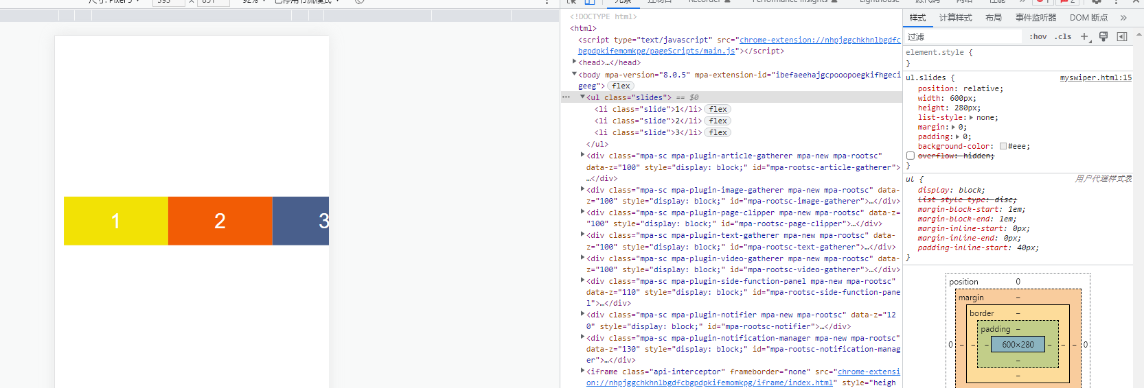
首先先写了所需要的三个子元素。分别给了三种颜色。
接下来。最外层加上overflow: hidden,让只显示一个slide子元素
ul.slides { position: relative; width: 600px; height: 280px; list-style: none; margin: 0; padding: 0; background-color: #eee; overflow: hidden; }
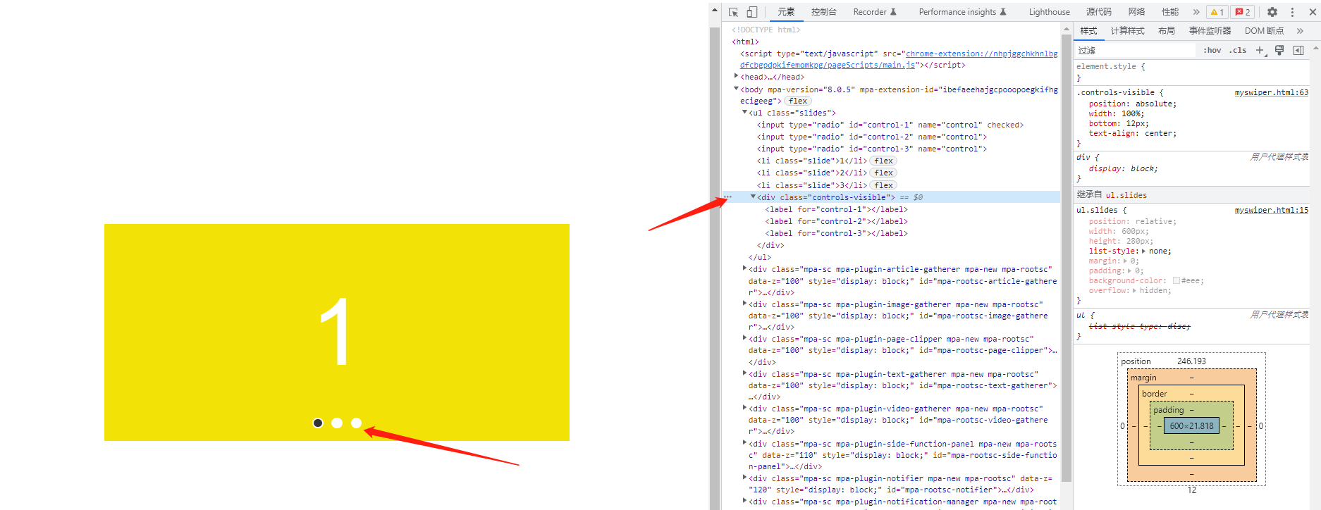
接下来,加上label和input起到控制切换的效果
html
<body> <ul > <input type="radio" id="control-1" name="control" checked> <input type="radio" id="control-2" name="control"> <input type="radio" id="control-3" name="control"> <li >1</li> <li >2</li> <li >3</li> <div > <label for="control-1"></label> <label for="control-2"></label> <label for="control-3"></label> </div> </ul></body>css
input[type="radio"] { position: relative; z-index: 100; display: none;}.controls-visible { position: absolute; width: 100%; bottom: 12px; text-align: center;}.controls-visible label { display: inline-block; width: 10px; height: 10px; background-color: #fff; border-radius: 50%; margin: 0 3px; border: 2px solid #fff;}.slides input[type="radio"]:nth-of-type(1):checked ~ .controls-visible label:nth-of-type(1) { background-color: #333;}.slides input[type="radio"]:nth-of-type(2):checked ~ .controls-visible label:nth-of-type(2) { background-color: #333;}.slides input[type="radio"]:nth-of-type(3):checked ~ .controls-visible label:nth-of-type(3) { background-color: #333;}这里利用input和label来模拟轮播图的pagination分页功能。label模拟的是圆点,然后把radio输入框隐藏了。radio放在最前面的目的是为了用了控制后面的slides 和controls的 样式
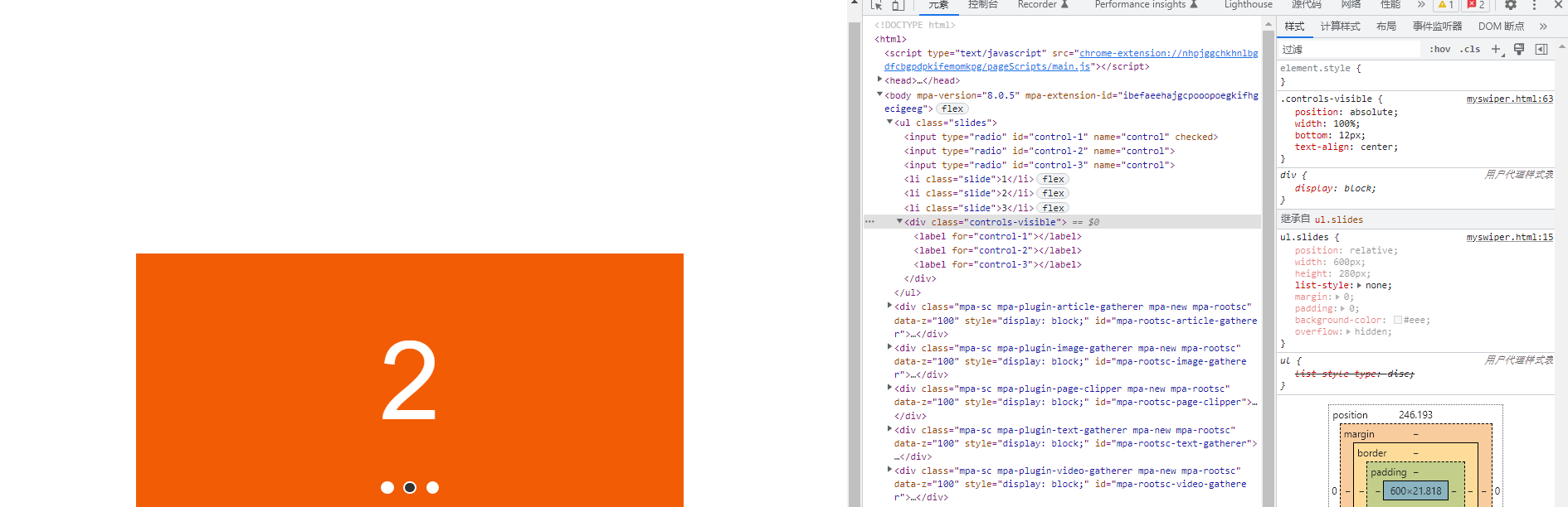
现在实现点击label切换轮播图的效果
.slides input[type="radio"]:nth-of-type(1):checked ~ .slide { transform: translatex(0%);}.slides input[type="radio"]:nth-of-type(2):checked ~ .slide { transform: translatex(-100%);}.slides input[type="radio"]:nth-of-type(3):checked ~ .slide { transform: translatex(-200%);}可以看到已经非常地简单就实现了点击lebel切换轮播图的效果。
当然,我们要实现一个上下页切换的功能也非常简单
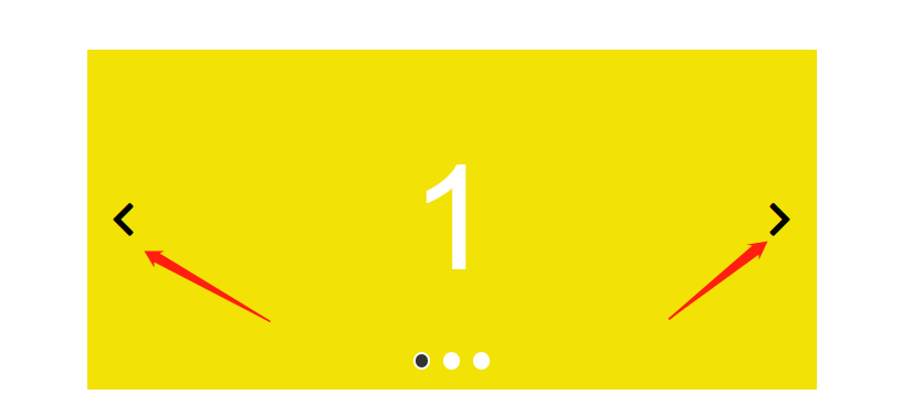
我们添加三组navigator,一页页面对应一组
<body> <ul > <input type="radio" id="control-1" name="control" checked> <input type="radio" id="control-2" name="control"> <input type="radio" id="control-3" name="control"> <div > <label for="control-3"> 《 </label> <label for="control-2"> 》 </label> </div> <div > <label for="control-1"> 《 </label> <label for="control-3"> 》 </label> </div> <div > <label for="control-2"> 《 </label> <label for="control-1"> 》 </label> </div> <li >1</li> <li >2</li> <li >3</li> <div > <label for="control-1"></label> <label for="control-2"></label> <label for="control-3"></label> </div> </ul></body>我们要把不属于当前的那一页的navigator隐藏掉,所以用display:none,当选中对应的页面的时候,再让它显示出来,所以可以这样实现
.navigator { position: absolute; top: 50%; transform: translatey(-50%); width: 100%; z-index: 100; padding: 0 20px; display: flex; justify-content: space-between; box-sizing: border-box; display: none; } .navigator { font-size: 32px; color #333333; } .slides input[type="radio"]:nth-of-type(1):checked~.navigator:nth-of-type(1) { display: flex; } .slides input[type="radio"]:nth-of-type(2):checked~.navigator:nth-of-type(2) { display: flex; } .slides input[type="radio"]:nth-of-type(3):checked~.navigator:nth-of-type(3) { display: flex; }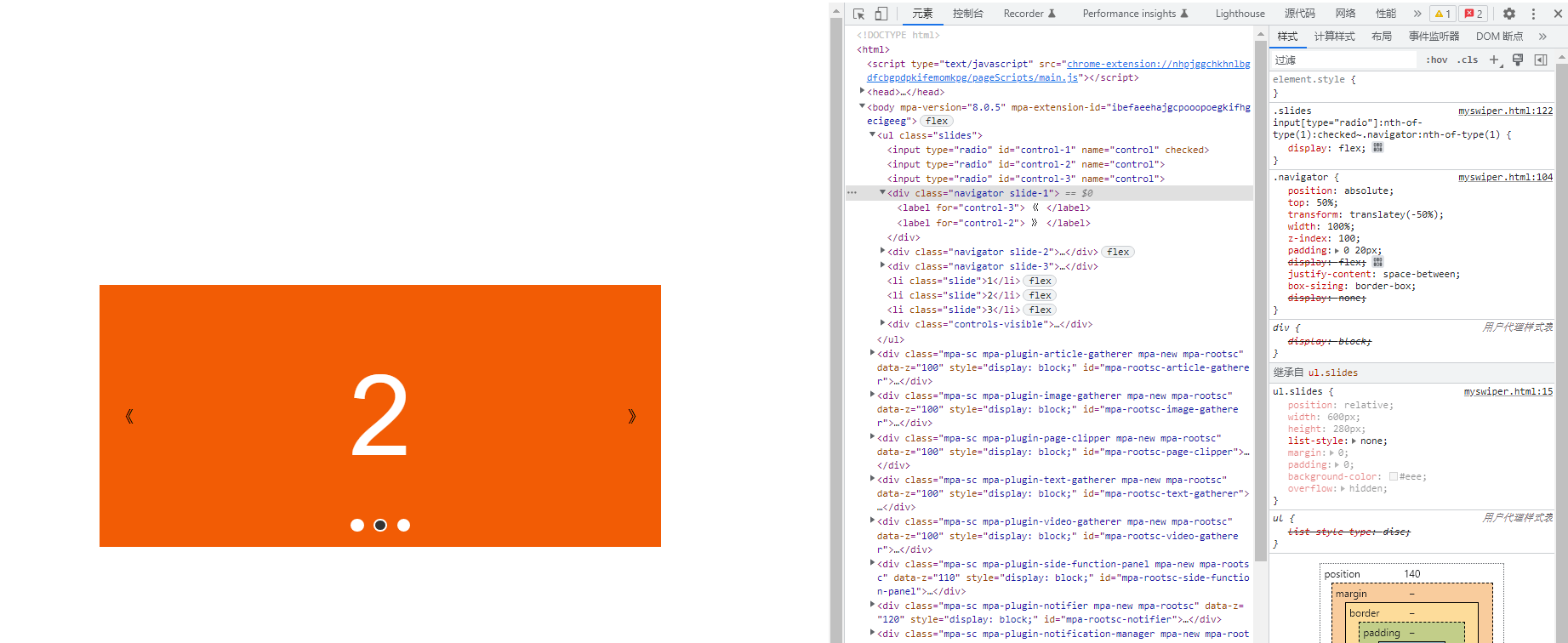
可以看到,又轻而易举就实现了点击切换上下页的功能,太腻害了。